AutoID Badge designer
Maintain badges
Select Maintain badges from the System menu, to open this table, which contains all badge designs currently on your system:
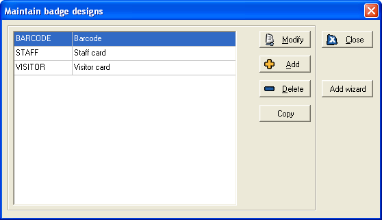
You can modify an existing badge design by clicking the Modify button. This opens the Badge designer and Badge properties forms together (see below for details on how to use these forms).
Badge designs can be deleted if they are no longer required - click the Delete button and then confirm the deletion when prompted.
If you wish to add a badge that is very similar to an existing design, click the Copy button. When prompted, select the existing badge design that you wish to copy, and then enter a different name for the copy. Click OK and the Badge designer form will open for this new design, and you can make any amendments to it in the same way as for other badges. Changes on the copy will not affect the original.
6.1 Add a new badge design
If you wish to create a new badge design, click the Add button. You must then enter a unique name for the new badge design. When you have done so, the Badge designer form is displayed, with the Badge properties form alongside.
(Note that you may find it easier to create a simple badge using the wizard - for details, see Badge creation wizard, page 68).
6.2 Badge designer
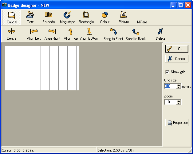
This form is used to define the layout of your badge.
- Cancel - This icon is used as the default mode, and can be clicked if you wish to deselect any of the other options you have clicked.
The other six icons at the top of the form allow you to add individual features to the badge. To add one of the features, click the required icon and then click and drag the mouse in the place you wish the feature to be on the badge. For further details:
- Text - see page 60.
- Barcode - see page 62.
- Mag. stripe - see page 64.
- Rectangle - see page 65.
- Colour - see page 66.
- Picture - see page 66.
The Alignment Toolbar beneath these icons:

These buttons allow you to align objects with each other on a badge, as well as to send objects to the front or back of an image or to delete them. They work as follows:
Centre: highlight an object on the badge designer and then click this button to move the object automatically to the centre of the badge.
Align Left: you can use this button to align the left of an object to the left of another object on the badge. First highlight the object that you wish to move and then click this button. You will be asked to select a second object to align the first with.
Align Right: you can use this button to align the right of an object to the right of another object on the badge. First highlight the object that you wish to move and then click this button. You will be asked to select a second object to align the first with.
Align Top: you can use this button to align the top of an object to the top of another object on the badge. First highlight the object that you wish to
Align Bottom: you can use this button to align the bottom of an object to the bottom of another object on the badge. First highlight the object that you wish to move and then click this button. You will be asked to select a second object to align the first with.
Bring to Front: you can use this button to bring an object to the foreground of the badge. First highlight the relevant object and then click the button. The object should be brought to the front of the badge.
Send to Back: you can use this button to send an object to the background of the badge. First highlight the relevant object and then click the button. The object should be moved to the back of the badge.
Delete: highlight an object that you wish to delete from the badge design and then click this button. You will be asked to confirm.
The options on the right-hand side can be used to assist you when designing the badge.
Show grid - when this option is ticked a grid is shown on the display, to help you align features evenly (this is only shown as a guide in the Badge designer, and does not affect the actual badge).
Zoom - when this is set to '1', the badge is shown in its real size. Clicking the up arrow allows you to see the badge in greater detail, while the down arrow lets you zoom out.
The status bar at the bottom of the form shows you exactly which point on the badge the cursor is currently hovering over, and the size (x by y) of the currently selected feature on the badge. This can help you align features precisely.
6.3 Badge properties
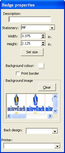
This is the default Badge properties form, shown when you first open the Badge designer:
(NB: If you add any feature to the badge (from one of the six icons on the Badge designer), the Badge properties form will be replaced by a properties form for the feature added (Text properties, Barcode properties etc.). To retrieve the Badge properties form, you must then click within the background of the badge.)
The top section of the Badge properties form is used to define general properties of the badge:
- Description - this is shown alongside the badge name wherever it is used in Auto-ID.
- Stationery - the drop-down list contains all types of stationery set up on your system (see Design stationery, page 75 for details). If you change the badge design to a different type of stationery, you will be given the option of changing the badge size to fit the different stationery type.
- Width/Height - enter the size of the badge. If you change this, the Badge designer will change immediately to reflect the change. (NB: The units used can be changed between metric and inches on the Local preferences form, page 87).
The bottom half of the form is used to set the background of the badge:
- Background colour - if you wish to have one colour as the background for the badge, click the colour box next to Background colour, and select the required colour from the form that appears (you can also define a custom colour on this form, if required).
- Print border - this adds a thin border around the edge of the badge.
- Background image - the thumbnail images shown in this section are all those saved in the Image gallery (see Image gallery, page 31, for details). You can select one of these images to be the background of the badges.
- Back design - the drop-down list allows you to select the design to use on the back of the badge, i.e., you can select a different badge design to print on the back of this badge design, or use the same design on the back as on the front.
The impact of any changes you make on this form will be shown immediately on the Badge designer form.
6.4 Text box
This icon is used for entering a text box.

The Text properties form looks like this:
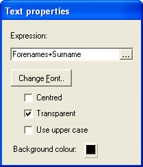
The Expression box should be used to enter the text you wish to show on the badge. You must use a formal expression, in the manner of the example above. To ensure you enter a valid expression, click this button at the right of the box:

This opens the Expression builder:
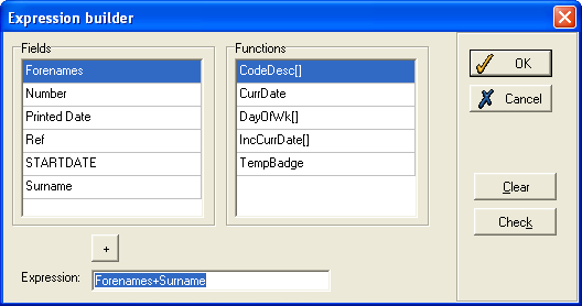
The expression above will show the badge holder's forename and surname, separated by a single space.
You can select any of the fields in the Fields box to include in the expression (the options depend on the fields in the data set). Double click on a field to add it to the expression. There are also a number of Functions you can add. These work as follows:
- CodeDesc[] - this allows you to show the description for a coded field rather than the code itself. For example, if you want the badge to show an employee's department, then the expression Department might show '20', '21' etc. If the expression is CodeDesc[Department] instead, you might see 'Sales', 'Production' etc.
- CurrDate - this is used to enter the current date, i.e., the date the badge is printed.
- DayOfWk[] - this shows the day of the week of the date returned by the field entered as the parameter (e.g., entering the expression DayofWk[Badge printed date]+' '+Badge printed date would give the day of the week followed by the date of the badge being printed).
- IncCurrDate[] - this sets a period of time (in days) after which the badge will expire.
- TempBadge - this shows that it is a temporary badge, and not a permanent badge of the type that would be assigned to an employee.
- The + symbol is required if you wish to include more than one field, or to include a field with other text.
If you wish to enter any text which cannot be defined by an expression (for example, to have the word Visitor on all badges), then enter the required text as the expression enclosed in single quotation marks (e.g., 'Visitor'). This can then be combined with text from a field (e.g., 'Visitor'+' '+Surname).
Once you have entered the required Expression, click OK and you will see the result of that expression for the selected person in the Badge designer view.
You can also change a number of settings of the appearance of the text box. Clicking the Change Font button brings up a form on which you can change the font type, size, colour and effects. You can also use the following tick-boxes:
- Centred - when ticked, this aligns the text to the centre of the text box. Otherwise the text will be aligned to the left.
- Transparent - this specifies whether the text box will have a transparent background. When not ticked, you should select a Background colour by clicking on the colour box at the bottom and selecting the colour required for the background.
- Use upper case - when ticked, the text will all be in upper case. When not ticked, the text will be shown in the case it is entered in the data set.
6.5 Barcode
This icon adds a barcode to the badge design:

The barcode contains information about the badge and the badge holder that can be read at a terminal. The Barcode properties form looks like this:
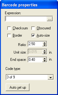
The Expression box works in the same way as the expression for a text box (see above).
The result of the expression (in this case the badge number) is encoded and displayed in barcode form on the badge. There are a number of settings of the barcode which you should define:
- Checksum - when ticked, this adds an extra character to the end of the barcode. This character depends on all the other characters in the barcode. This is an extra check which means that, if the barcode reader misreads a character before this final checksum character, the checksum character will be read as invalid, so an error will be displayed on the reader.
- Obscured - when ticked, the barcode is hidden in a black background, preventing the barcode from being photocopied.
- Border - adds a thin border around the barcode.
- Auto-size - when ticked, the barcode is resized automatically to fit inside the box drawn on the Badge designer form. Otherwise you will have to set the size manually using the options below.
- Ratio - this sets the comparative width of the thick bars and the thin bars - the value must be between 2 and 3.
- Unit size - you can only change this if Auto-size has not been ticked above. It allows you to set the width of each unit in the barcode.
- End space - the width of the white space at each end of the barcode. This helps reduce reading errors.
- Code type - the drop-down list contains different types of barcode. Select the type you require.
The Auto set up button, when clicked, returns all the barcode properties you have changed back to the default settings.
6.6 Magnetic stripe
This adds a magnetic stripe to the badge:

Note that the size, shape and position of the box you draw on the Badge designer form are not important, as the magnetic stripe is in a set position on the stationery. The box simply indicates to the system that the magnetic stripe should be used. You will see this Magnetic stripe properties box:
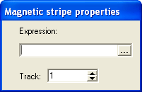
In the Expression box, enter the expression containing the information which is to be encoded on the magnetic stripe. This works in the same way as the expression for a text box (see page 61).
The Track box allows you to select which track on the magnetic stripe the data will be recorded on - choose 1,2 or 3.
6.7 Rectangle
This allows you to add a rectangular shape to the badge:

You will see this Rectangle properties form:
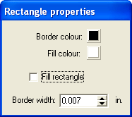
Select the Border colour and Fill colour by clicking on the relevant colour box and choosing the colours you require from the options given. You can define custom colours if necessary. The Fill colour will only appear if the Fill rectangle box is ticked. Otherwise the rectangle will be transparent.
The Border width is the width of the border - you can use the up and down arrows to change this, or type the new value in directly.
6.8 Colour cycling

Select this Colour icon to add a rectangle which can change colour depending on the date the badge is printed, or another appropriate date. The Colour properties form looks like this:
This is used to determine what colour the rectangle will appear on a given date.
In the Repeat pattern box, the drop-down list allows you to select how often the pattern changes. In the above example, there will be a different colour each week.
The Colour repeat order, at the bottom of this form, is the order in which the colours will be used for this rectangle. Clicking the Add button allows you to select a colour to use in the cycle. After all the colours have been used (after seven weeks in the above example) the colour will return to the first selected colour. Clicking Delete removes the selected colour from the cycle.
The Base date is the date when the cycle begins.
The Date field is the field from the database which is used by the system to work out which colour will be used on which date. In the above example, Badge printed date is the date field, meaning that the date the badge is printed will be set against the Base date and the length of the Repeat pattern, to determine which colour is used. There may be other fields that you can choose for the Date field - if so, you can select one of them from the drop-down list.
The Border width is the width of the border around the rectangle. If the Colour the border box is ticked, it will be this border that changes colour, while the rectangle fill will remain transparent.
6.9 Image
This option allows you to add an image to the badge:

The Image properties form is displayed:
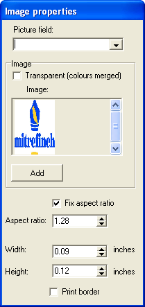
There are two broad types of image you can enter onto a badge - an individual picture that is different for different badges (e.g., employee photographs), or a generic image used on every badge of this design (e.g., a company logo).
To enter the former, select a Picture field from which the picture is to be taken. On a standard data set, there will be a field called Picture which is used for the individual's picture, but there may be other options on your system - these will be available from the drop-down list.
If you wish to use a general image instead of a picture of an individual, click on the thumbnail of the required image in the Image section. All images in the image gallery are shown here (for details, see Image gallery, page 31).
To add an image that is not in the image gallery, click the Add button. You will be prompted to enter a name for the image, and then you will be taken to a blank version of the Image processor, to set the image as you require it (see Image processor, page 29). Once you have done so, click OK and a thumbnail of the new image will be shown alongside the others from the gallery. Select it by clicking on it, and it will now appear in the badge design.
To make sure that the image is always the right shape, tick the Fix aspect ratio box. This means that, if you increase the horizontal size of the image, the vertical size will increase by the ratio given as the Aspect ratio. This value can be changed using the arrows to the right of the box.
Tick the Print border box if you wish to insert a thin border around the edge of the image.
6.10 Badge creation wizard
The Badge creation wizard is a tool which takes you through the process of creating a new badge design in easy steps. You may find it easier to create a simple design using this wizard, and then, if you wish to make it more advanced, use features of the Badge designer and Badge properties forms.
From the Maintain badge designs form, click the Add wizard button. This is the first screen of the wizard:
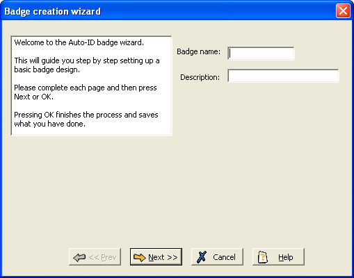
(On all screens, you can click Next to move forward, and Prev to move back to the Previous screen. However, you are prevented moving forward until you have entered the minimum mandatory information.)
On this screen, simply enter the Badge name (this must be unique) and a Description of the badge design.
Click Next to move onto Step 2:
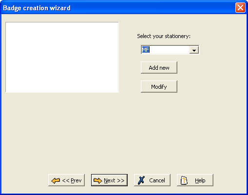
On this screen, select the type of stationery to use for the card, from all those that exist on your system. If you wish to amend this stationery for the new badge design, click the Modify button to open the Stationery details form, which can be used to change any settings of the selected stationery type (for details see Design stationery, page 75).
Alternatively, click the Add new button if you wish to enter a new type of stationery. You will have to enter a unique name for the new stationery type, and then you will be taken to a blank version of the Stationery details form, which can be set up in the same way.
Click Next to open Step 3:
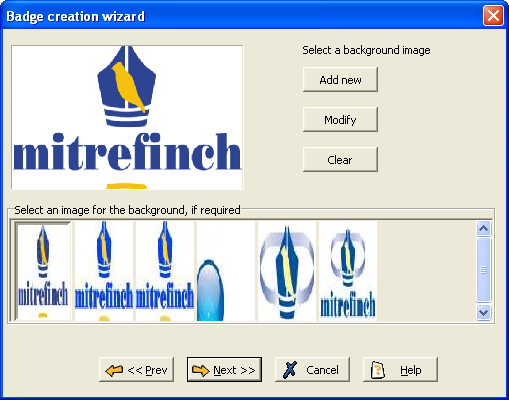
This is used to select the background image of the badge. The thumbnail images in the bottom box are all those images previously saved - click on one of these images to select it as the background. You can then amend the selected image by clicking Modify, which opens the Image processor. Modify the image in the manner described in Image processor (see page 29).
Alternatively, if you need to create a new image for the background, click the Add new button. This will open a blank version of the Image Processor (see Image processor, page 29, for details on creating a new image).
If you wish the badge to have a blank background instead, click the Clear button.
Click Next to move on to Step 4:
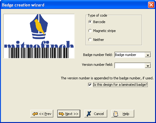
On this screen, select what information (if any) is encoded on the badge, and in what format. In the Type of code section, select whether the code is to be a Barcode or a Magnetic stripe. If you select Neither, no information will be encoded on the badge.
You must also select which field is used for the Badge number field (you will normally want to select Badge number, as above). If you are using version numbers, you can select a Version number field as well.
You should tick the box if the design is for a laminated badge.
Click Next to move to Step 5:
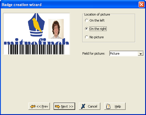
If you wish to include a picture on the badge, select the Field for picture (on standard data sets, Picture will be the employee's photograph). Once you have selected the field to use, select the Location of picture. You can select No picture if you do not want a picture on the badge.
Click Next to open Step 6:
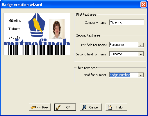
This screen is for entering the text you wish to display on the badge. Note that you must enter either the First field for name or the Field for number as a minimum for a valid badge design.
The First text area is text that will be present on all badges, e.g. the Company name. Type this text directly.
In the Second text area there are two fields for name - for each of these you should select a field from the drop-down list that will be shown on the badge (on a standard data set, you would probably want to use the Forename and Surname fields).
The Third text area is used for further information from a field (in the above example, Badge number is selected).
Click OK, and the badge creation wizard is complete. You will see the new badge in the Maintain badge designs table. It can now be selected and modified like any other badge.